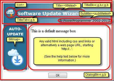
The areas that are ringed / arrowed in red in the screenshot below can all be customised using keywords in your script file, on an update section by update block basis.
Therefore, you can change the look and feel or title / subtitle text for each update section in your script separately, should you wish to.
Click on the highlighted areas in the screenshot to navigate to the appropriate section of the 'Keywords' reference page for more information.
If you omit any of the keywords shown here from your update section then the default look and feel (shown in the screenshot) will be used.
You can also change the default size of the dialogs using the MessageBoxScale keyword.
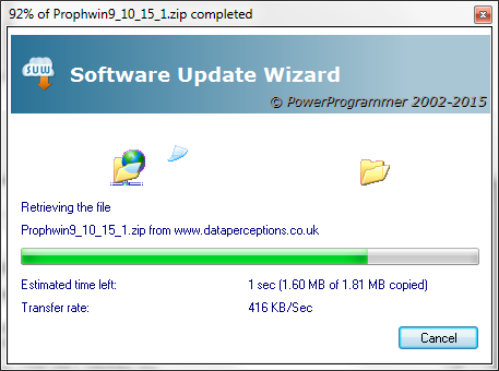
Note that you can also customise the 'downloading' dialog box using these options. However, the 'downloading' dialog does not use a web browser control for rendering and the download progress text messages are rendered using standard 'static' controls. However, you can change all of the other cosmetic options using the keywords shown in the screenshot above.
The main message window is a Microsoft web browser control. Therefore any valid web page URL starting "http://" or in-line html can be used in message box texts or language files.
A vertical scroll bar is rendered by default. To remove it use the following html:
<body scroll="no"...
You can remove the border surrounding the web browser control using css styles:
<body style="border:0px;"...
You can supply a simple html template in your script which causes all message windows to then be rendered using the template. An example of this is:
MessageBoxBoilerPlate=<body scroll="no" style="border:0px;font-family: Arial, Helvetica, sans-serif; font-size: small; color: #000080; background-color: #FFFFCC">[!Content!]</body>
This template causes all message boxes displayed during the update process to be rendered in the style of the template. The message box text is inserted into the boilerplate to replace the placeholder text "[!Content!]".
See the keyword help page for MessageBoxBoilerPlate for more information.
Note that the following (case-sensitive) 'tags' may be used in the html used to drive the web control on the dialogs:
| Tag | What it does |
|---|---|
| <nobitmap> | The web browser control expands horizontally to cover the full width of the dialog box. |
| <noheading> | The web browser control expands vertically to cover the graduated title area of the dialog box. |
|
|
The web browser control expands vertically to cover the area where the OK or Yes/No buttons are usually displayed. The buttons are painted on top of the web browser control. |
| <MessageBoxScale=x,y> | Scales the entire parent dialog box by a width and height percentage. For example, including the tag "<MessageBoxScale=120,130>" scales the parent dialog box to 120% of its default width and 130% of its default height. This tag overrides the default scale (including that set by the MessageBoxScale keyword) for the single dialog box in which the tag is used. |
You may use these tags in combination. You can put them anywhere in your html - the Software Update Wizard will identify and remove them from the rendered html.
Note that it is also possible to suppress display of some or all of the Software Update Wizard's interface through the entire update process. Click this link for more information.
In addition, you can display a scrolling link control at the bottom of the message boxes, as shown in this screenshot:

This feature uses the ScrollingLink= keyword line and is described here.
Standard message boxes (e.g. confirmation of files unzipped from a Zipfile) will display the same bitmap, icon and title text as specified by the keywords described above.
However, if you use any of the special <nobitmap>, <noheading> or <overlapbuttons> options described above in your Message= line the standard boxes will be visually different as they will continue to display a bitmap, a heading and the buttons in a non-overlapped state.
The way to make the standard message boxes match your customised message boxes is to use a custom language file, the implementation of which is described here.
This means you can also customise the text on each standard message, within the parameters described, if you like.
In the language file, you can use the same 'mark-up' as you would in the 'Message=' to manage the appearance of the dialogs.
Note: You will need to restart the Software Update Wizard service in order to make it pick up your language file changes, as the language file, if found, is only loaded at start-up.
Finally, here is a fully customised message box, using all the options:
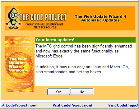
(N.b. The Software Update Wizard is not endorsed or in any way connected with CodeProject.com. We have just mocked up a relevant sample to illustrate what is possible! Having said that, CodeProject is a fantastic developer resource, and PowerProgrammer thoroughly recommends it!)
Here are some more examples of message box customisation:
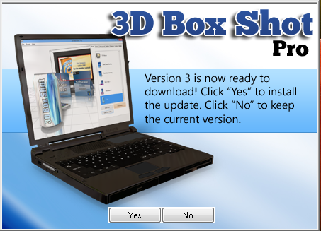
The 'Yes' / 'No' buttons are layered on top of the dialog box at runtime. The rest of the design is a .png file at position 0,0 in an otherwise empty web page (tip - use the scroll="no" option as a <body> attribute). As the surface you see in the screenshot is a web browser control you can literally render anything that works in an IE browser on your Software Update Wizard message box.
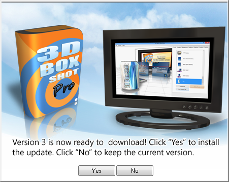
Here is another example. The design meant that the default message box size would cause the 'Yes' / 'No' buttons to appear over the message text, so the "MessageBoxScale=101,112" keyword line was added to the update script to scale the dialog size appropriately: